G Suite
gsuite_bq.png
Annual and quarterly reports are a standard part of business for many enterprises. But automation can help eliminate the repetition inherent in these periodic obligations. If you find yourself needing to analyze and present findings from large sets of stored data, you can conveniently use BigQuery, Sheets, and Apps Script–all in a single workflow–to generate recurring content in seconds. Most notably, the Sheets data connector for BigQuery provides you with an interactive UI in Sheets that pulls data straight from BigQuery using standard SQL.
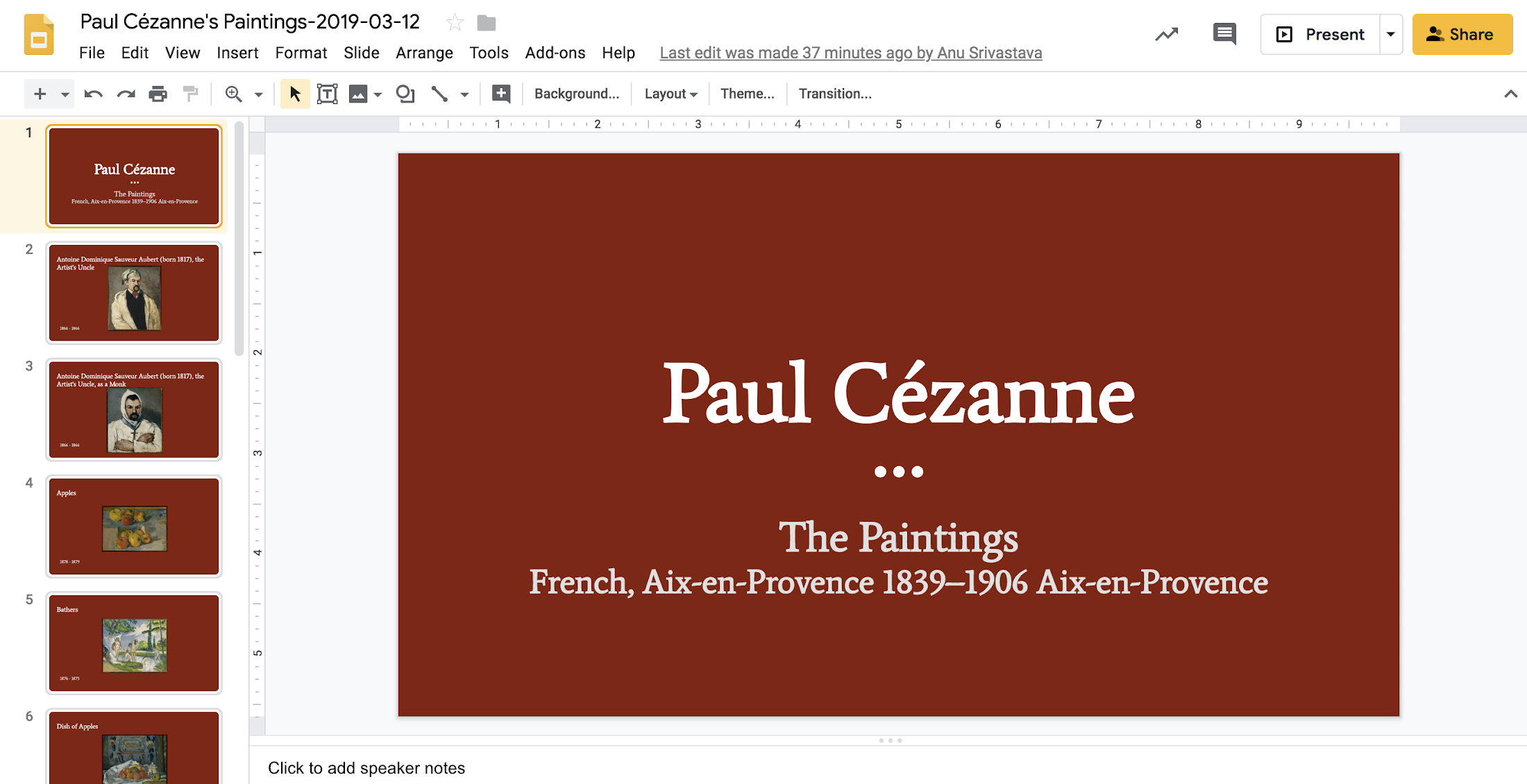
To see an example of this solution in action, let’s pretend you’re an art history professor who needs to generate slide decks for a semester’s worth of classes. The Met Public Domain Art Works public dataset in BigQuery has all the images and metadata you need to create lessons that will highlight a different artist each week.
For example, take a look at a recent lesson on Paul Cezanne:
Templatizing the slide deck
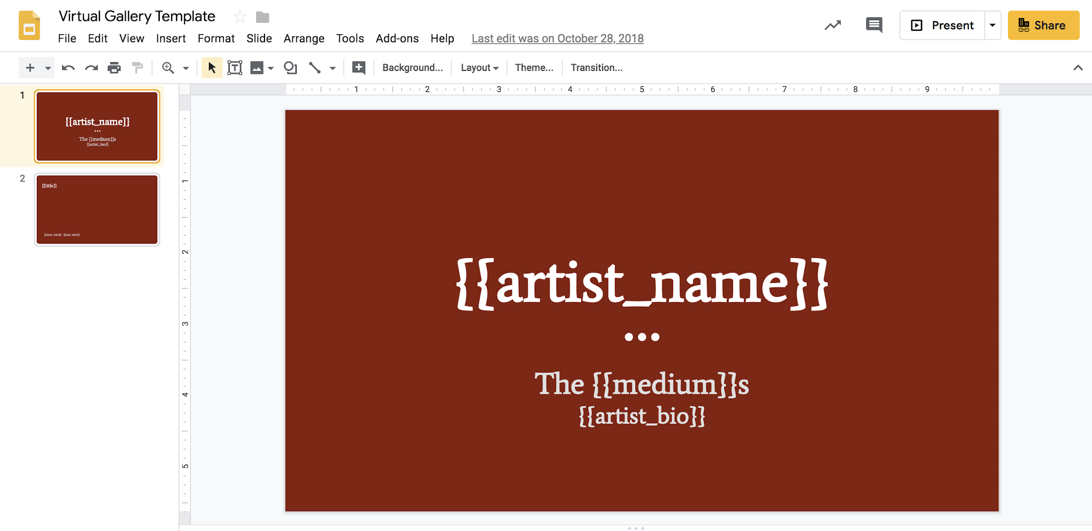
Each of the slide decks you’ll make for class are quite similar. They start with a title slide with the artist’s name and other biographical information. Following the title slide, you’ll see several slides that include an image, date, and title of a piece of art. You can easily turn this structure into a template deck that includes tags for each of these fields. Similar to mail merge, you can use these tags as placeholders for populating the source data.
Accessing the data
In order to pull this data from The Met Public Domain Art Works, you’ll want to use the Sheets data connector for BigQuery. Using the data connector requires a G Suite Business, Enterprise, or Education account and a BigQuery account and project.
Each of today’s lessons focuses on one artist and one medium. With the data connector, you can query datasets from BigQuery using a web UI and visualize the results, all without ever leaving your spreadsheet.. Here’s what your example query should look like in the editor:
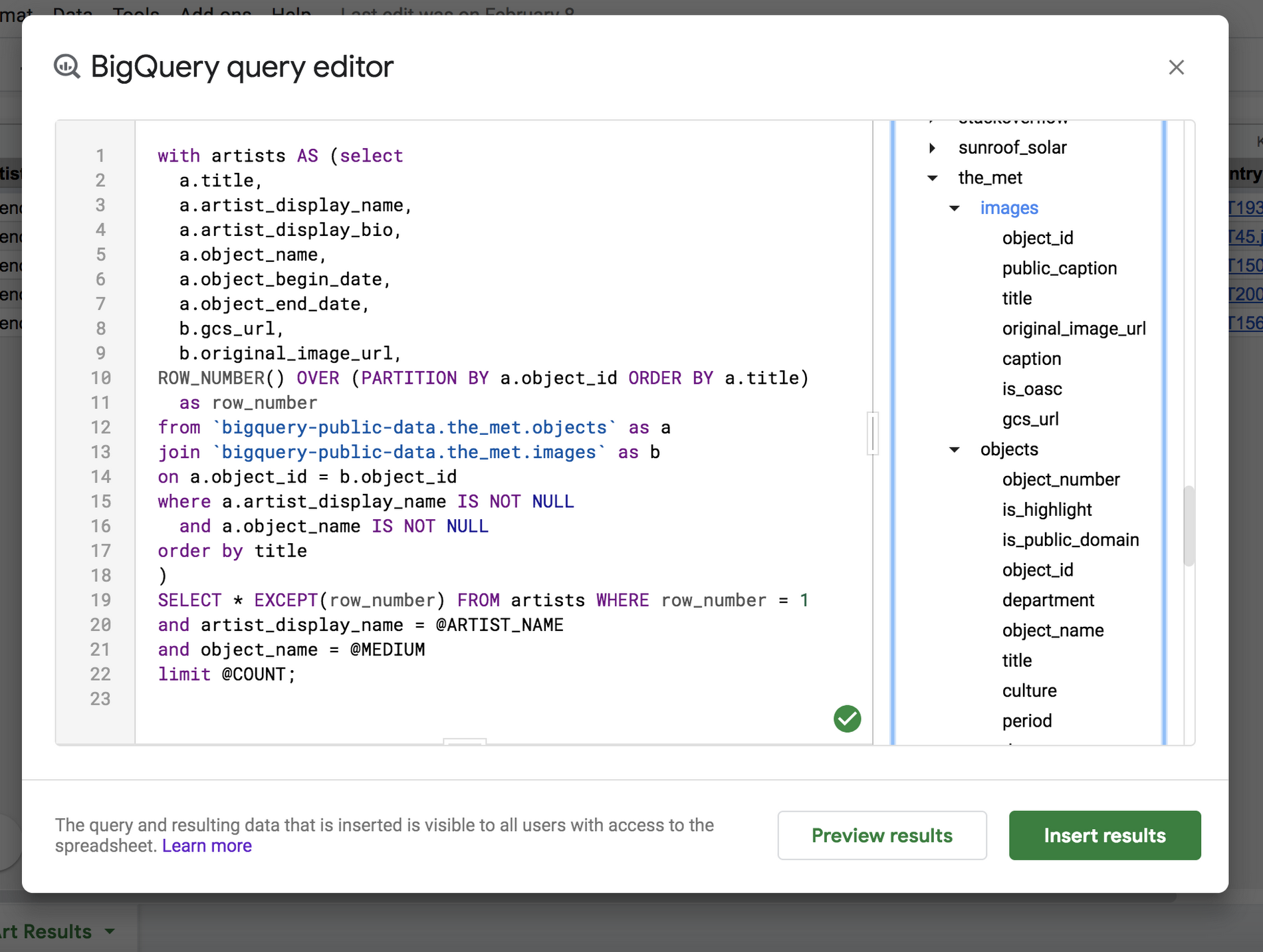
You’ll notice some parameters within the query, such as @ARTIST_NAME, @MEDIUM, and @COUNT. By using parameters, you can easily swap in new artists, mediums, and number of works and run the query without updating any SQL!
You’ll want to use a new sheet within the same spreadsheet to store your parameters. In this sheet, you’ll designate specific cells for your artist of choice, medium, and number of slides.
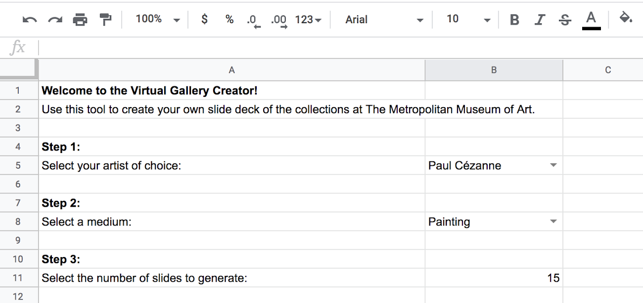
Once your configuration sheet is set up, you should set your parameters to point directly to these cell references in the query editor.
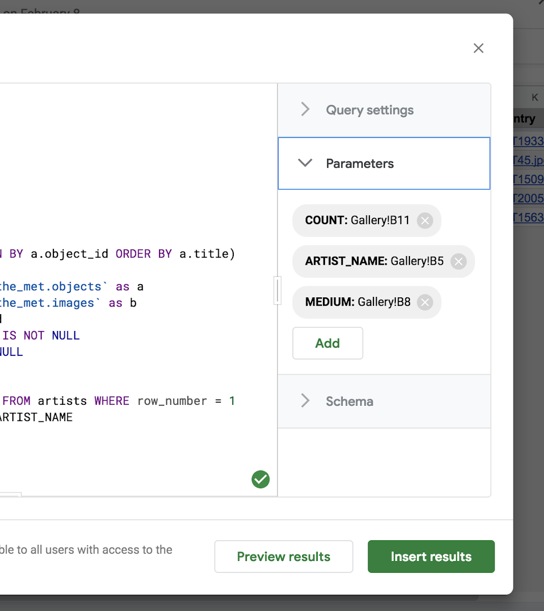
Now you can select any combination of artist, medium, and slide count in your configuration sheet, and hit the ‘Refresh’ button in the data sheet to perform the query.

Tying it all together with Apps Script
Once you hit refresh, you’ll see the query results with the images and data you need for your weekly lesson. No need for a late Sunday evening, professor! In order to create your final presentation, you’ll need a bit of Apps Script to merge this data with a copy of the template slides. The less than 100 lines of Apps Script performs four main functions:
- Copies the template slide deck and renames it
- Adjusts the number of art slides for your images
- Inserts the metadata, including work title and date, into your art slides
- Inserts the images into your art slides
Finally, you’ll add a final step to your configuration sheet which includes a “Generate” button, which begins execution of the script.
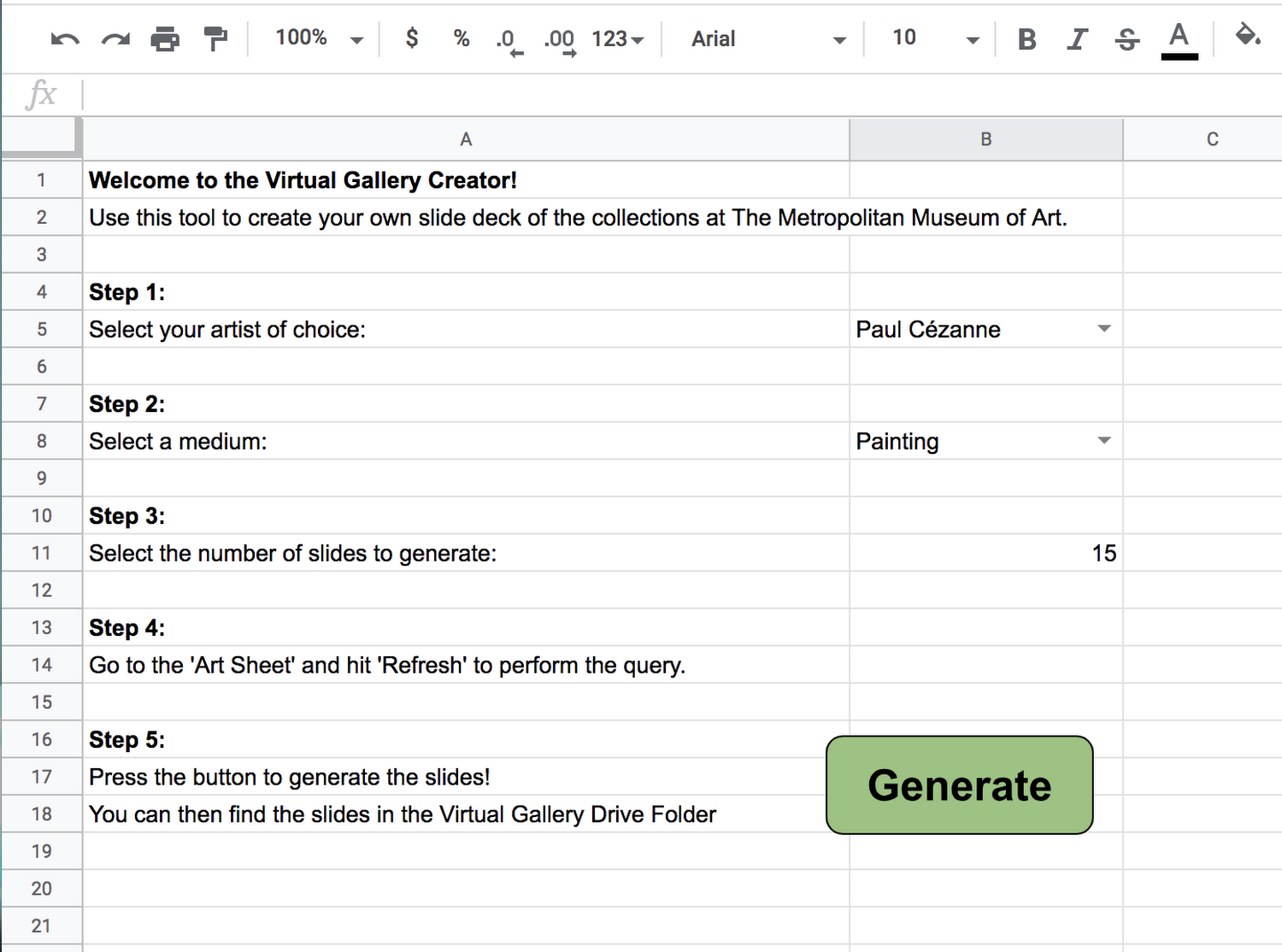
If you navigate to your Google Drive home screen, you’ll see your newly minted slide deck on the Recents menu. In five simple steps, you’ve created a deck in a matter of seconds! Of course you need not be an art history professor to put this workflow to use. This process can help you build quarterly reports, or gather metrics at the drop of a hat for a senior stakeholder. Whatever your industry, when a senior manager asks for some numbers “stat!” or “pronto!” you’ll know how to deliver. Try out the Sheets data connector today.
And if you have any feedback–or helpful examples or suggestions–reach out to Anu and Alicia on Twitter!


